H
ello guys. How are you all? I hope you are all well. I came again with a post. Let’s go..

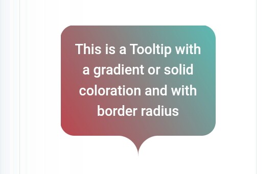
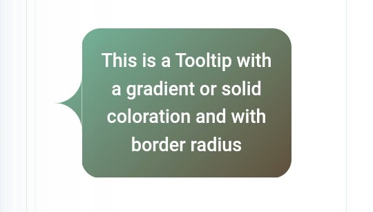
Tooltips Code No. 21
Example
Css Code
.tooltip {
  color: #fff;
  font-size: 18px;
  max-width: 28ch;
  text-align: center;
}
.tooltip {
  --s: 1.5em; /* triangle size */
  --p: 50%; /* triangle position (0%:left 100%:right) */
  --r: 1em; /* the radius */

  padding: 1em;
  border: var(--s) solid #0000;
  border-radius: calc(var(--r) + var(--s));
  background: border-box linear-gradient(60deg,#CC333F,#4ECDC4); /* the coloration */
  --_m: 100%/var(--s) var(--s) no-repeat;
  --_p: clamp(var(--r) + 3*var(--s)/2,var(--p),100% - var(--r) - 3*var(--s)/2);
  -webkit-mask:
    linear-gradient(#000 0 0) padding-box,
    radial-gradient(100% 100% at 100% 100%,#0000 99%,#000 102%) calc(var(--_p) + var(--s)/2) var(--_m),
    radial-gradient(100% 100% at 0    100%,#0000 99%,#000 102%) calc(var(--_p) - var(--s)/2) var(--_m);
}
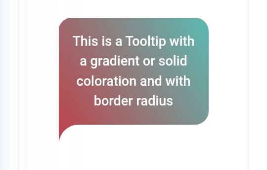
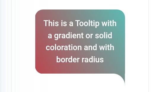
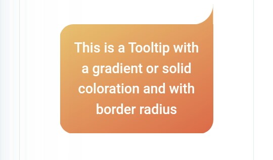
Tooltips Code No. 22
Example
Css Code
.tooltip {
  color: #fff;
  font-size: 18px;
  max-width: 28ch;
  text-align: center;
}
.tooltip {
  --s: 1.5em; /* triangle size */
  --p: 50%; /* triangle position (0%:left 100%:right) */
  --r: 1em; /* the radius */

  padding: 1em;
  border: var(--s) solid #0000;border-radius: calc(var(--r) + var(--s));
  background: border-box linear-gradient(-30deg,#D95B43,#ECD078); /* the coloration */
  --_m: 0/var(--s) var(--s) no-repeat;
  --_p: clamp(var(--r) + 3*var(--s)/2,var(--p),100% - var(--r) - 3*var(--s)/2);
  -webkit-mask:
    linear-gradient(#000 0 0) padding-box,
    radial-gradient(100% 100% at 100% 0,#0000 99%,#000 102%) calc(var(--_p) + var(--s)/2) var(--_m),
    radial-gradient(100% 100% at 0    0,#0000 99%,#000 102%) calc(var(--_p) - var(--s)/2) var(--_m);
}
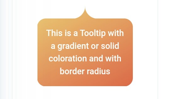
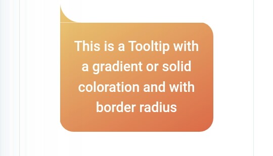
Tooltips Code No. 23
Example
Css Code
.tooltip {
  color: #fff;
  font-size: 18px;
  max-width: 28ch;
  text-align: center;
}
.tooltip {
  --s: 1.5em; /* triangle size */
  --p: 50%; /* triangle position (0%:top 100%:bottom) */
  --r: 1em; /* the radius */

  padding: 1em;
  border: var(--s) solid #0000;
  border-radius: calc(var(--r) + var(--s));
  background: border-box linear-gradient(45deg,#490A3D,#F8CA00); /* the coloration */
  --_m:/var(--s) var(--s) no-repeat;
  --_p: clamp(var(--r) + 3*var(--s)/2,var(--p),100% - var(--r) - 3*var(--s)/2);
  -webkit-mask:
    linear-gradient(#000 0 0) padding-box,
    radial-gradient(100% 100% at 100% 100%,#0000 99%,#000 102%) 100% calc(var(--_p) + var(--s)/2) var(--_m),
    radial-gradient(100% 100% at 100% 0   ,#0000 99%,#000 102%) 100% calc(var(--_p) - var(--s)/2) var(--_m);
}
Tooltips Code No. 24
Example
Css Code
.tooltip {
  color: #fff;
  font-size: 18px;
  max-width: 28ch;
  text-align: center;
}
.tooltip {
  --s: 1.5em; /* triangle size */
  --p: 50%; /* triangle position (0%:top 100%:bottom) */
  --r: 1em; /* the radius */

  padding: 1em;
  border: var(--s) solid #0000;
  border-radius: calc(var(--r) + var(--s));
  background: border-box linear-gradient(-45deg,#5E412F,#78C0A8); /* the coloration */
  --_m:/var(--s) var(--s) no-repeat;
  --_p: clamp(var(--r) + 3*var(--s)/2,var(--p),100% - var(--r) - 3*var(--s)/2);
  -webkit-mask:
    linear-gradient(#000 0 0) padding-box,
    radial-gradient(100% 100% at 0 100%,#0000 99%,#000 102%) 0 calc(var(--_p) + var(--s)/2) var(--_m),
    radial-gradient(100% 100% at 0 0   ,#0000 99%,#000 102%) 0 calc(var(--_p) - var(--s)/2) var(--_m);
}
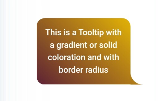
Tooltips Code No. 25
Example
Css Code
.tooltip {
  color: #fff;
  font-size: 18px;
  max-width: 28ch;
  text-align: center;
}
.tooltip {
  --s: 1.5em; /* triangle size */
  --r: 1em; /* the radius */

  padding: 1em;
  border: var(--s) solid #0000;
  border-radius: calc(var(--r) + var(--s));
  border-bottom-left-radius: 0;
  background: border-box linear-gradient(60deg,#CC333F,#4ECDC4); /* the coloration */
  -webkit-mask:
    radial-gradient(100% 100% at 100% 100%,#0000 99%,#000 102%)
      var(--s) 100%/var(--s) var(--s) no-repeat border-box,
    linear-gradient(#000 0 0) padding-box;
}
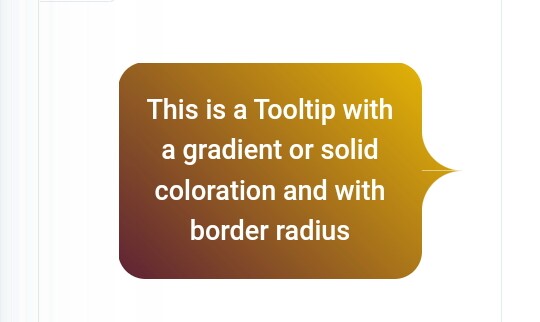
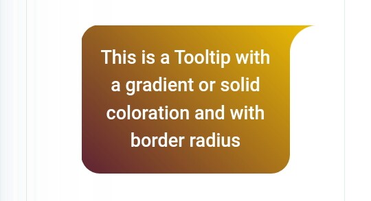
Tooltips Code No. 26
Example
Css Code
.tooltip {
  color: #fff;
  font-size: 18px;
  max-width: 28ch;
  text-align: center;
}
.tooltip {
  --s: 1.5em; /* triangle size */
  --r: 1em; /* the radius */

  padding: 1em;
  border: var(--s) solid #0000;
  border-radius: calc(var(--r) + var(--s));
  border-bottom-right-radius: 0;
  background: border-box linear-gradient(60deg,#CC333F,#4ECDC4); /* the coloration */
  -webkit-mask:
    radial-gradient(100% 100% at 0 100%,#0000 99%,#000 102%)
      calc(100% - var(--s)) 100%/var(--s) var(--s) no-repeat border-box,
    linear-gradient(#000 0 0) padding-box;
}
Tooltips Code No. 27
Example
Css Code
.tooltip {
  color: #fff;
  font-size: 18px;
  max-width: 28ch;
  text-align: center;
}
.tooltip {
  --s: 1.5em; /* triangle size */
  --r: 1em; /* the radius */

  padding: 1em;
  border: var(--s) solid #0000;
  border-radius: calc(var(--r) + var(--s));
  border-top-left-radius: 0;
  background: border-box linear-gradient(-30deg,#D95B43,#ECD078); /* the coloration */
  -webkit-mask:
    radial-gradient(100% 100% at 100% 0,#0000 99%,#000 102%)
      var(--s) 0/var(--s) var(--s) no-repeat border-box,
    linear-gradient(#000 0 0) padding-box;
}
Tooltips Code No. 28
Example
Css Code
.tooltip {
color: #fff;
font-size: 18px;
max-width: 28ch;
text-align: center;
}
.tooltip {
–s: 1.5em; /* triangle size */
–r: 1em; /* the radius */
padding: 1em;
border: var(–s) solid #0000;
border-radius: calc(var(–r) + var(–s));
border-top-right-radius: 0;
background: border-box linear-gradient(-30deg,#D95B43,#ECD078); /* the coloration */
-webkit-mask:
radial-gradient(100% 100% at 0 0,#0000 99%,#000 102%)
calc(100% – var(–s)) 0/var(–s) var(–s) no-repeat border-box,
linear-gradient(#000 0 0) padding-box;
}
Tooltips Code No. 29
Example
Css Code
.tooltip {
  color: #fff;
  font-size: 18px;
  max-width: 28ch;
  text-align: center;
}
.tooltip {
  --s: 1.5em; /* triangle size */
  --r: 1em; /* the radius */

  padding: 1em;
  border: var(--s) solid #0000;
  border-radius: calc(var(--r) + var(--s));
  border-top-right-radius: 0;
  background: border-box linear-gradient(45deg,#490A3D,#F8CA00); /* the coloration */
  -webkit-mask:
    radial-gradient(100% 100% at 100% 100%,#0000 99%,#000 102%)
      100% var(--s)/var(--s) var(--s) no-repeat border-box,
    linear-gradient(#000 0 0) padding-box;
}
Tooltips Code No. 30
Example
Css Code
.tooltip {
  color: #fff;
  font-size: 18px;
  max-width: 28ch;
  text-align: center;
}
.tooltip {
  --s: 1.5em; /* triangle size */
  --r: 1em; /* the radius */

  padding: 1em;
  border: var(--s) solid #0000;
  border-radius: calc(var(--r) + var(--s));
  border-bottom-right-radius: 0;
  background: border-box linear-gradient(45deg,#490A3D,#F8CA00); /* the coloration */
  -webkit-mask:
    radial-gradient(100% 100% at 100% 0,#0000 99%,#000 102%)
      100% calc(100% - var(--s))/var(--s) var(--s) no-repeat border-box,
    linear-gradient(#000 0 0) padding-box;
}
S
o friends, that’s it for today. See you in another post. If you like the post then like and comment. Stay tuned to Trickbd.com for any updates.
The post আপনার ওয়েবসাইট এর জন্য 50 প্রকার Tooltips Style নিয়ে নিন। || Part 03 appeared first on Trickbd.com.
0 comments: